
Völuspá
The word ‘Völuspá’ is the name of an Icelandic poem that tells the story of the creation and eventual end of the world.
It describes violent landscapes and the horrifically beautiful sight of volcanos erupting. The poem reflects how Iceland is unforgiving and, in some parts, uninhabitable. This makes it residents some of the most resilient people in the world. With that in mind, I wanted to recognise Iceland as home to a most unique people with a culture rich with mythology.

The goal was to recomposes matter, energy sources, natural phenomena, and temporalities to produce objects of aesthetic utility.
Collaborating with natural elements in this way invites a deep relationship with time through learning the temporal expressions of natural processes. Today, the Eldraun Lava Field looks very peaceful and serene. The thick green moss has helped softened the rugged landscape, almost disguising Eldhraun’s violent past.
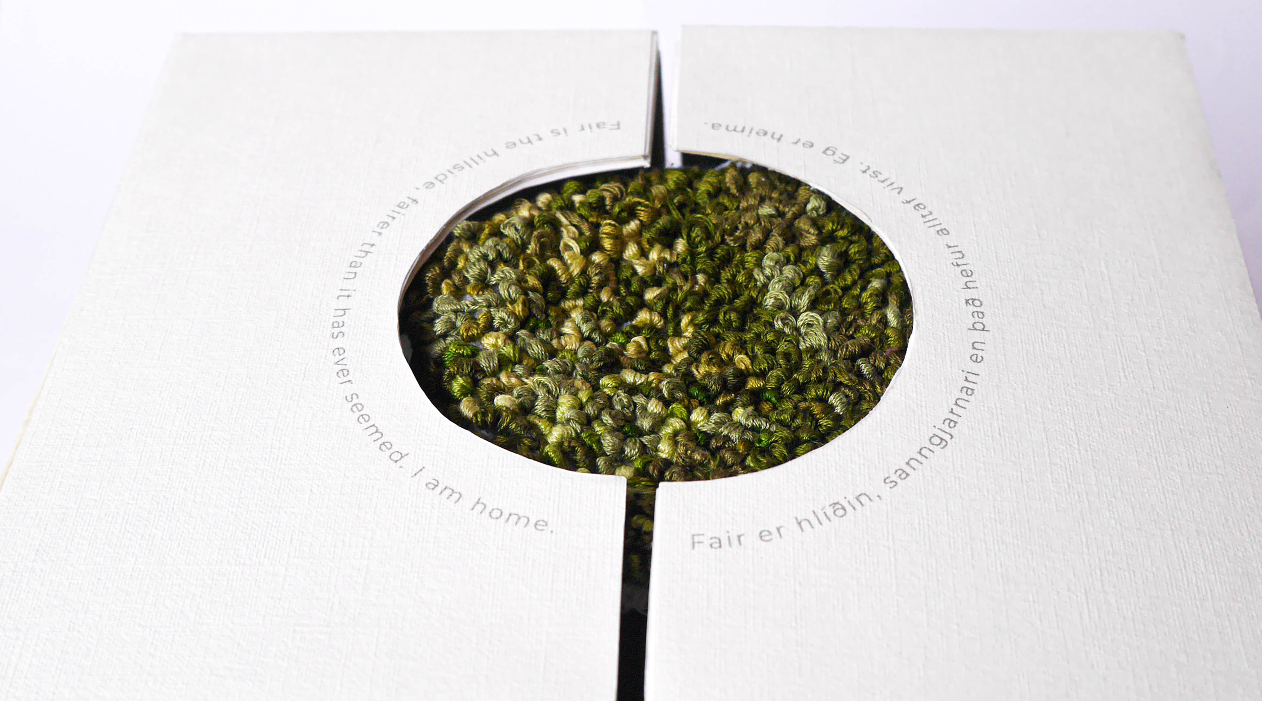
Thus, for the embroidery aspects of the packaging, I have used homegrown wool dyed with toxic free colours sourced from naturally occurring pigments. The booklets and cards are made from recycled paper. Finally, linen is one of the most biodegradable and stylish fabrics in fashion history. It is strong, naturally moth resistant, and made from flax plant fibres, so when untreated it is fully biodegradable. Our mission was to produce a product and package that respected the Icelandic culture and environment. If left for one hundred years, the teapot would become a site where Icelandic woolly fringe- moss could colonise the bare basalt (volcanic rock) as seen at Kirkjubæjarklaustur. This was the key inspiration behind the packaging.

MATERIALS
I have incorporate UV varnish on a matte paper to contrast the linen paper exterior. The smooth paper lining the inside folds of the box creates a variance between the embroidered linen base. As a closure, I have include a tea cosy that is hand embroidered keepsake that accompanies the teapot, additionally a fold out poem illustration booklet that can sit out on a self.
Additionally, I’ve included silver ink detailing on the inner layer opening of the box that glimmers in the light it catches as a contrast finish. I have gone for a minimalist approach by not flaunting the logo, instead placing a subtle illustration of the landscape of Iceland with a home at the centre of it, signify homewares and provenance, additionally the linen embroidery is custom made.